 The logo itself has earned high praise. However, the long and laborious procedure of emblem selection is just as memorable. It records the ardor, difficulties, and competitive spirit of all the people involved. Even after the unveiling of the long-anticipated logo, the stories behind it remain worthy of repeating. The logo itself has earned high praise. However, the long and laborious procedure of emblem selection is just as memorable. It records the ardor, difficulties, and competitive spirit of all the people involved. Even after the unveiling of the long-anticipated logo, the stories behind it remain worthy of repeating.
On July 2, 2002, the Beijing 2008 Olympic Design Conference opened at the Beijing International Convention Center, officially kicking off the logo design competition. More than 600 leading designers from all over the world joined the conference offering their professionalism and experience.
It’s going to be the first Olympic games held in China. How can local designers afford to miss the great opportunity of creating a unique Chinese logo? With just such an itch to give it a try, the Beijing Armstrong Visual Identity Corp, or AVIC hastened to start their work immediately after the conference.
Guo Chunning, Designer of 2008 Being Olympic games Logo, said, “I carefully listened to the speeches at the conference and was very enlightened.”
From the very beginning, the designers in the company agreed on a totally original logo for the Beijing Olympic Games.
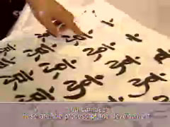
Guo also said, “The emblem originated from the Chinese word “jing”, the second part of “Beijing”. We tried to change its figure in the direction of personification. You can see these are the process of the development. The strokes were changed like this in order to make it look more like a runner while resembling the figure of another Chinese word of “dragon”. Our idea was very simple at the time. In my opinion, as China is going to host the Olympic Games, first of all, we should try to let foreigners know the word “jing” and take advantage of an important opportunity to publicize Chinese culture.”
One of the major challenges facing the designing team was how to handle the problem of the two long strokes resembling a person’s legs. The company’s president took the lead himself in the design of the Seal emblem.
“This is our design work submitted to the BOCOG on Oct. 8, 2002, the deadline for entries. We had a total of 6 designs for the competition, and this is the original one selected as the final emblem. The reason is that the emblem presents itself as a logo, or a symbol. From the perspective of its originality, the concept of a seal is among the earliest logos in China. As a fine symbol, it is still popular nowadays. It is recognizable upon first look in terms of the meanings that it carried, including the virtue of promise. The reason why we used the form of a seal is that we wanted to tell the world that we’d hold the best ever and absolutely outstanding Olympic games. A seal can not only contain a meaning of promise, but also introduce a unique cultural phenomenon and an artistic form. Fortunately, these elements join together in the emblem design,” said Guo Chunning.
5 pm, October 8, 2002 was the deadline for all designers to submit their works to the BOCOG. However, Guo Chunning and his colleagues presented their emblem design less than one hour before the deadline. In their words, “we wanted it to be better and better before we submitted it.” They kept their design nearly to the last minute to eliminate the possibility of unwanted disclosure.
By the deadline on October 8, 2002, the BOCOG had received 1,985 entries. Among them more than 1,700 were produced by designers from the Chinese mainland, Hongkong and Taiwan, with the rest coming from the U.S., Japan, Australia and other countries. The selection panel consisting of 7 local judges and 4 foreign ones put some 100 designs on the list of the second round of selection. In November 2002, the experts committee chose the top 10 designs. Work No.1498 was given the highest scores after a thorough review. According to several judges, there were some other very impressive designs with Chinese cultural symbols such as dragons, the Great Wall, etc. “But No. 1498 was certainly the most special in style and meaning.”
 By year’s end, Beijing Armstrong Visual Identity Corp got a formal notification from the BOCOG with a requirement to make revisions to one of their submitted works, No. 1498.
Guo Chunning, Designer of 2008 Olympic games logo, said, “The selection panel made the decision and informed us to make revisions to our work. The major requirement of the experts was to make the design more lively because they thought it lacked innovation. Then we had a try in the handling of the logo figure. Adjustments in two aspects were made. One was to stretch the two leg-like strokes on the emblem to make hem more like a pair of running legs. The other revision was to strengthen its kinetic potential. We all agreed that the emblem figure represents two people at the same time, one is the athlete, the other is Beijing citizen enjoying the sports jubilantly with arms outstretched to embrace the world and welcome the friends from the five major continents. From the perspective of graphic arts, there are real figures and virtual images. You can feel the existence of something that does not appear at all. In this way we were able to successfully solve the problem of its carrying a stiff look. Besides, we added the flavor of the word “dragon” to its strokes.”
The experts from the design companies of previous Olympic games’ logos as well as the IOC image advisors were invited to discuss and revise this “seal” design with its creators. In other words, this design became the hottest candidate among the top 10. All involved cooperated well and were able to improve what was already the best submission. But another problem turned up. The few English words under the running figure looked un-matched with the personified figure above them.
The experts’ opinion was confirmed by another round of hard work from the design team. And they call it one of the toughest phases during the whole design process.
Guo said, “It was a very new subject that English words could be written in Chinese calligraphy. No matter how we wrote these few English words, it seemed that they were written by non-Chinese hands. During our discussion on this matter, there was an intermezzo-like story. Miss Xu, the girl friend of our designer Mao Cheng offered us a very good advice, which came like a bright light. This was the right style that we had been seeking painstakingly. It combined elegance, grace and the characteristics of Chinese culture and represented a typical Chinese flavor.”
The shining light for Guo and his colleagues was the font of simplified Chinese. It allowed the use of Chinese calligraphic handwriting with strong traditional flavor. The design team was then able to make rapid progress towards the final accomplishment. At the same time, the BOCOG logo selection panel called together a colloquium. People from many social sectors offered their wisdom and opinions to perfect the “seal” logo. With a concerted effort made, the newly named “China Seal, Dancing Beijing” settled in to its final look. And when it was done, all concerned were amazed at how closely it expressed their deepest wishes for the logo and for the games it would come to represent.
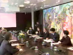
On Feb.28, 2003, the proposed emblem design got approval from the state council. One month later, a BOCOG delegation left for Lausanne where the IOC is headquartered to present the emblem. Jiang Xiaoyu, Head of the visiting delegation delivered a report to IOC president Jacques Rogge, informing him of the whole process of the emblem selection, in strict conformity with the IOC standards and requirements.
“The Chinese leadership, people from the commercial sector and Beijing citizens are both actively involved and full of expectation,” said Jiang Xiaoyu, Vice President of BOCOG.
After listening to the presentation, Jacques Rogge was extremely pleased to see the proposed logo. He even took the lead in applauding it once he laid eyes on it. Quite surprisingly, he approved the design of “China Seal” in a unique Chinese way. He printed his own seal below the copy of the logo before he signed his name and described it as a “perfect and poetic” design.
More than one year of hard work won the BOCOG Mountains of praise and appreciation. And these turn out to be not only an award next to none, but also a powerful dynamo to drive the preparations for the Beijing 2008 Olympic games further forward. There is no doubt that China will accelerate its endeavors in the years to come. And there will be also more pleasant surprises worthy of future expectation.
The unveiling of the Beijing Olympic Games’ logo injects great surprise and pleasure into the hearts of people in China and around the world. It signifies a milestone in Beijing’s overall preparations. The commotion raised by the grand sports event is far from settled, because from this moment on, a comprehensive arrangement including commercial operations will be carried out step by step. The goal is clear for Beijing and China: to host an outstanding Game in 2008.
|


 The logo itself has earned high praise. However, the long and laborious procedure of emblem selection is just as memorable. It records the ardor, difficulties, and competitive spirit of all the people involved. Even after the unveiling of the long-anticipated logo, the stories behind it remain worthy of repeating.
 By year’s end, Beijing Armstrong Visual Identity Corp got a formal notification from the BOCOG with a requirement to make revisions to one of their submitted works, No. 1498.